Interview
Understand goals, friction, and current workflows.
Turning a fragmented component library into a scalable product foundation—built for consistency, responsive behavior, and clearer collaboration.
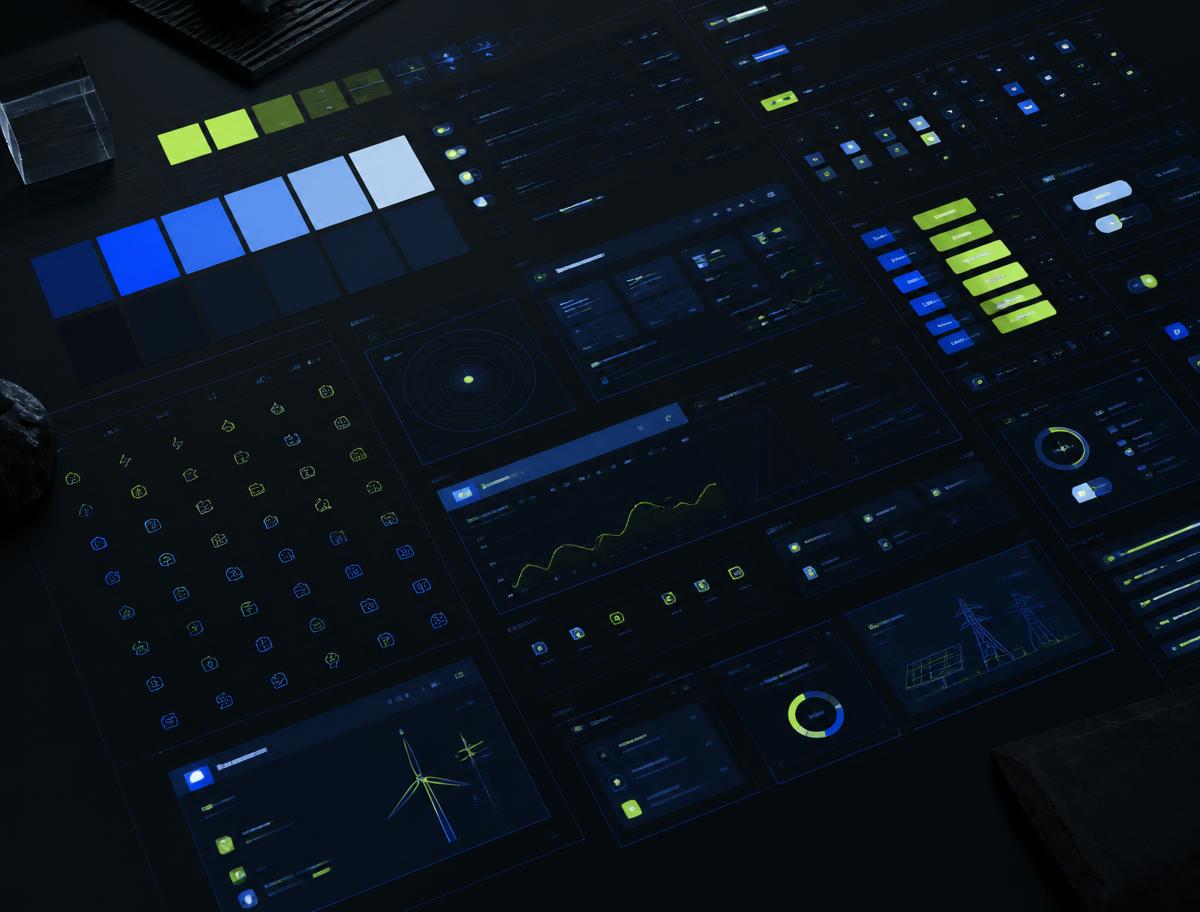
Research artifact / 04
Card sorting revealed the system’s natural component architecture.
Multiple designers had contributed components with different structures, naming patterns, and levels of Figma proficiency. Repetition accumulated, single-use patterns crowded the library, and product teams struggled to find a shared source of truth.
My mandate went beyond visual cleanup. I needed to create a system the organization could understand, maintain, and extend—while improving the working relationship between design and development.
100+
Components
17+
Categories
Variables
Figma-powered
2 modes
Light and dark
Responsive
Desktop and mobile
Multi-product
Shared foundation
One-to-one interviews exposed where the system was failing people: unclear patterns, uneven Figma knowledge, and a handoff process that separated designers from developers.
Understand goals, friction, and current workflows.
Find duplicates, exceptions, and one-off components.
Build a shared model for categories and discoverability.
Keep what scales; merge or retire what does not.
Variables connected brand decisions to reusable components. Responsive type rules, shared states, and light and dark modes turned the library into a foundation multiple products could rely on.
Core actions / states
Control primitives
Color variables
Responsive scale
One decision propagates across colors, type, space, and states.
Desktop and mobile scales stay connected instead of separately maintained.
Light and dark themes use the same semantic component logic.
The first version of ESDS 2.0 assumed everyone used the system the same way. They didn’t. Product designers wanted strict, locked components. Marketing wanted layout freedom. Engineers wanted naming that matched code. Content designers wanted patterns, not parts. A single set of rules made three of those four groups work around the system instead of with it.
What worked
Talking to each group first surfaced the real failure: not messy components, but conflicting expectations.
Categories teams named themselves became the navigation everyone could actually use.
Tokens let brand change once without renegotiating every component.
What didn’t
Fully locked components protected product consistency but blocked marketing’s campaign work—so they detached and rebuilt, quietly forking the system.
Names that made sense in Figma didn’t match component names in code, so handoff conversations restarted every sprint.
A single rollout presentation didn’t change habits. Usage only moved once contribution and review had an owner.
The pivot
We stopped designing one system and started designing tiers of freedom: locked core components for product, flexible composition blocks for marketing, and code-aligned naming shared with engineering. Governance became a standing review rather than a launch—and the fork closed on its own.
ESDS 2.0 established a coherent foundation across product, website, and editorial experiences. More importantly, it made the logic visible: teams could find patterns faster, understand why they existed, and contribute without recreating the same solution.